At-A-Glance
Measured Usability on the Iowa Cubs Website Through Expert Reviews & Usability Testing
I worked on evaluating and improving the usability of the Iowa Cubs website, a baseball team site where users were struggling to complete core tasks due to unclear labels, hidden steps, and poor feedback. To address these issues, our team conducted expert reviews using usability heuristics, followed by usability testing to validate our findings and uncover deeper user insights. This process led to actionable design recommendations that improved navigation clarity and overall user experience.
I contributed by defining the types of data to collect during usability testing and redesigning key interaction flow based on the testing outcomes.
My Role
UX Research
UX Design
Skills
Heuristic Evaluation
Cognitive Walkthrough
Usability Testing
Wireframes
Context
8 weeks
Summer 2024
Academic Projects
Collaborators
Ashely Delarm
Karly Greenfield
Clarissa Hyun
Design Process

Heuristic Evaluation
Expert Review to Uncover Usability Issues
We began with a heuristic evaluation based on Nielsen Norman Group’s Ten Usability Heuristics to identify usability issues across the site. The issues were rated on a 0-4 scale from a Nielsen Norman severity rating system for usability problems. 46% of usability errors (23 erros) were classified as 3 (Major Usability Problmes), and 9 ones (18%) were classified as 4 (Usability Catastrophe).
I don’t agree this is a usability problem
Cosmetic problem only:
Need not be fixed unless extra time is available on project
Minor usability problem:
Fixing this should be given low priority
Major usability problem:
Important to fix, so should be given high priority
Usability catastrophe:
Imperative to fix this before product can be released
Heuristic Evaluation
Major Usability Issues Uncovered Through Expert Review
The most frequently violated heuristics were Visibility of System Status, Aesthetic and Minimalist Design, and Error Prevention, which together accounted for 46% of the total issues. This suggests that the website appears unnecessarily cluttered, making it harder for users to understand where they are or what’s happening. As a result, users are more likely to feel lost while navigating and to make errors that the system should be preventing.

Cognitive Walkthrough
Key Criteria for Evaluating Learnability
Following the heuristic evaluation, we conducted a cognitive walkthrough using four key questions to evaluate the site’s learnability and assess how users interact with the interface. This method helped us pinpoint areas where new users, especially patients unfamiliar with the system, may encounter friction. We focused on what we identified as the main tasks on the website: purchasing tickets, buying merchandise, and viewing player statistics.
User Intent
Will users want to perform this action?
Control Visibility
Will users see the control (button, menu, switch, etc.) for the action?
Understandability
Once users find the control, will they recognize that it produces the effect they want?
Feedback
Will users understand the feedback they got, so they go on to the next action with confidence?
Cognitive Walkthrough
Inspects learnability for Core Tasks
Key issues that could be obscure for users to complete the core tasks were mostly ambiguous or inasscible / hidden labels, poor navigation, unclear next-step feedback. These issues made users lost in their tasks, made them hard to recover from their mistake due to lack of feedback.
Task 1: Buy a game ticket
Label Ambiguity
“Individual Tickets” is unclear; doesn’t explicitly indicate that it leads to ticket purchasing.

Task 2: Purchase a mens' jersey
Obscured Next Step
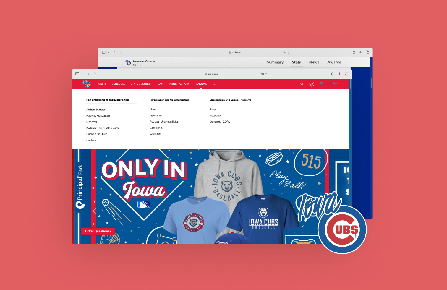
The “Shop” option is hidden under a vague “…” menu, making it difficult to find.

Task 3: Look at player's stats
No visual affordance
Player names don’t look clickable unless hovered.

Usability Testing
Test the Same Tasks with Users
After our heuristic evaluation and cognitive walkthrough, we conducted usability testing to validate assumptions and observe real user behavior on the Iowa Cubs website. We ran moderated sessions over Google Meet, using a screener, pre- and post-task surveys, and a final questionnaire. This helped us uncover pain points and understand how users made decisions in real time.
Participants
We recruited five participants through convenience sampling. Each participant was required to be 18 years or older and have an interest in sports. Being a Cubs fan was not required, as we wanted to avoid potential learning bias from participants already familiar with the site. Eligibility was verified through a screener survey.
| Participant Number | Age | Occupation | Follows Sports? | Date of Test |
|---|---|---|---|---|
| 1 | 20 | Graduate Student | Yes | 8/1/2024 |
| 2 | 25 | Graduate Student | Yes | 8/1/2024 |
| 3 | 58 | Software Engineer | Yes | 8/1/2024 |
| 4 | 25 | GNC Engineer | Yes | 8/2/2024 |
| 5 | 26 | Teacher | Yes | 8/3/2024 |
Tasks Evaluated
Participants were asked to complete three common tasks on the Iowa Cubs website:
- Purchasing a ticket for a game
- Purchasing a men’s team jersey
- Checking a player’s statistics for the current season
Types of Data Collected
To evaluate usability more deeply, we implemented a combination of qualitative and quantitative research methods.
Behavioral Metrics
- Click Path
- Success Rate
- Number of Errors
- Completion Time
- Verbal Reactions
Attitudinal Metrics
- Baseline familiarity and expectations
- Real-time feedback during task execution
- System Usability Scale (SUS)
- Net Promoter Score (NPS)
Key Takeaways
Unclear labeling & obscure steps likely to hinder core tasks
Task 2: Merchandise Purchase
Most participants had a hard time locating the "Shop" section
Users struggled to locate the “Shop” section, as it was not where they expected and lacked visual prominence. While two participants accessed it quickly via the homepage banner, others took significantly longer, often checking the “Fan Zone” or unrelated pages. One participant even landed on another team’s product page by mistake, highlighting issues with site structure and link clarity.

Task 3: Viewing Player Statistics
Most participants had a hard time locating the "Game Logs" section
The stats task had the lowest success rate, with only 2 out of 5 participants (40%) completing it. The “Game Logs” section was obscured, making it hard to find. One user, familiar with the site, still couldn’t locate it. Another left the site by mistake and had to restart. One spent 315 seconds exploring stats pages. Another followed a homepage banner but got lost in unrelated rankings.

SUS & NPS
The average System Usability Scale (SUS) score was 79.9, indicating a strong overall perception of usability. The Net Promoter Score (NPS) averaged 8.4, suggesting most users would recommend the website. However, scores varied due to navigation difficulties, particularly in merchandise and stats-related tasks. These issues affected users’ confidence and overall impressions.

Design Recommendations
Task 2: Merchandise Purchase
1. Move "Shop" link under "Fan Zone" or give it a more prominent placement.
By observing the click paths, we saw that three participants hovered over 'FAN ZONE,' suggesting they expected 'Shop' to be there. This indicates a mismatch between the users’ mental model and the website’s structure, which violates the heuristic “match between system and the real world.” To address this, we relocated the shop items under the 'FAN ZONE' category.

2. Replace the section with "Game Logs" as Tab Bar for easier for obvious access and navgation
The original player stats page felt visually cluttered, violating key design principles such as "Minimalist Design" and "Design Consistency." The use of excessive dividing lines created unnecessary separation between elements, making it difficult for users to understand the relationship between the scoreboard and filter options. To address this, we introduced a simplified navigation bar placed at the top right of the Game Logs section, with filter items neatly aligned to the right of the bar. This layout improves visual hierarchy and helps users scan and interact with the content more intuitively.

Reflection & If We Had More Time
Effective Usability Discovery
We began with a Heuristic Evaluation and Cognitive Walkthrough to quickly identify usability issues without involving users and to anticipate areas where users might get confused. These expert reviews helped us refine our design early on. We then conducted usability testing to validate our findings and uncover deeper insights that we couldn’t have predicted from our own perspective.
Conduct Card Sorts and Tree Tests
If we had more time, we would conduct card sorts and tree tests to refine the website’s information architecture. This would help ensure users can find what they’re looking for more effectively.
Validate the Revised Design
We would also run another round of usability testing to validate the revised website, measure its effectiveness, and identify further opportunities for improvement.