Measured usability via expert reviews & user testing
I evaluated and improved the usability of the Iowa Cubs website, where users were struggling to complete core tasks due to unclear labels, hidden steps, and weak feedback. We ran expert reviews (heuristics) then usability testing to validate findings and uncover deeper insights. The result was actionable design recommendations that improved navigation clarity and overall UX.
I contributed by defining data to collect during testing and redesigning key interaction flows based on results.
Design process

Heuristic evaluation: uncovering issues
We used Nielsen Norman Group’s Ten Usability Heuristics and a 0–4 severity scale. 46% of issues (23) were severity 3 — Major problems — and 18% (9) were severity 4 — Catastrophes.
- 0 — Not a usability problem
- 1 — Cosmetic problem only
- 2 — Minor usability problem
- 3 — Major usability problem (high priority)
- 4 — Usability catastrophe (must fix)
Most violated heuristics
Visibility of System Status, Aesthetic & Minimalist Design, and Error Prevention accounted for 46% of all issues, suggesting visual clutter, weak wayfinding, and preventable errors.

Learnability of core tasks
We inspected three primary tasks (tickets, merchandise, player stats) using four questions:
- User intent: Will users want this action?
- Control visibility: Will they see the right control?
- Understandability: Will they recognize its effect?
- Feedback: Do they understand system feedback?
Task 1 — Buy a game ticket
Label ambiguity: “Individual Tickets” doesn’t clearly indicate where to purchase.

Task 2 — Purchase a men’s jersey
Obscured step: “Shop” is hidden under an overflow menu, hard to discover.

Task 3 — View a player’s stats
No visual affordance: Player names don’t appear clickable until hover.

Methods & participants
We ran moderated sessions (Meet) with screener, pre-/post-task surveys, and a final questionnaire to observe real behavior and decision-making.
Participants
| # | Age | Occupation | Follows Sports? | Date |
|---|---|---|---|---|
| 1 | 20 | Graduate Student | Yes | 8/1/2024 |
| 2 | 25 | Graduate Student | Yes | 8/1/2024 |
| 3 | 58 | Software Engineer | Yes | 8/1/2024 |
| 4 | 25 | GNC Engineer | Yes | 8/2/2024 |
| 5 | 26 | Teacher | Yes | 8/3/2024 |
Tasks evaluated
- Purchase a game ticket
- Purchase a men’s team jersey
- Check a player’s current-season statistics
Data collected
Behavioral
- Click path, success rate, errors
- Completion time
- Verbal reactions
Attitudinal
- Baseline familiarity & expectations
- Real-time feedback during tasks
- System Usability Scale (SUS), NPS
What we learned
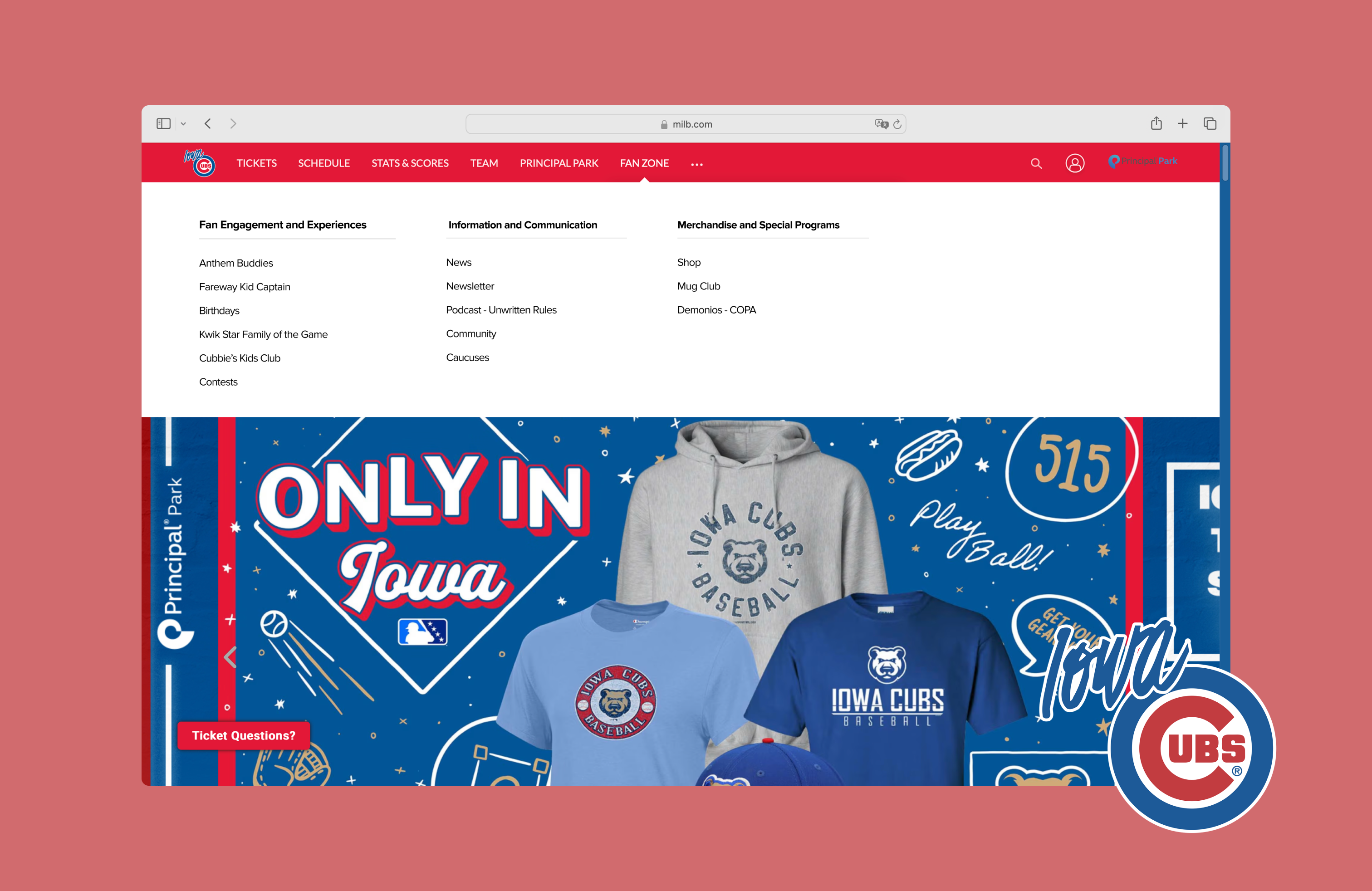
Task 2 — Merchandise purchase
Most participants struggled to find Shop—it wasn’t where they expected and lacked prominence. Some detoured to “Fan Zone” or unrelated pages; one landed on another team’s store.

Task 3 — Player statistics
Lowest success rate (2/5). Game Logs was obscured; one user left the site by mistake; another spent 315s exploring stats pages without success.

SUS & NPS
SUS averaged 79.9 (good usability). NPS averaged 8.4. Scores were pulled down by navigation difficulties—especially merchandise and stats.

Design recommendations
1) Move “Shop” or increase prominence
Click paths show people hovered “Fan Zone,” expecting to find Shop there—mismatch with users’ mental model (Match between system and real world). We relocated/elevated Shop for faster access.

2) Replace hidden “Game Logs” with a clear tab bar
The stats page felt cluttered; excessive dividers hurt scannability. We introduced a simplified tab bar and aligned filters to improve hierarchy and make the next step obvious.

If we had more time
Effective discovery
Heuristics + cognitive walkthrough quickly exposed issues and likely failure points. Usability testing then validated and deepened findings beyond our expert lens.
Next research
Run card sorts and tree tests to refine IA, followed by another test round to verify the revised design’s impact.